Literature Review:
I will begin by outlining the key points in some of the articles I read. The articles were on a wide variety of topics and were not always specific to my project. Therefore I will only explain the points I found useful. Each article taught me something different or confirmed in my mind what I wanted to do.
"Time for Renovations: A Survey of Museum Web Sites" (Jonathan P. Bowen)
Bowen explains that it is a museum curator's job to determine which objects should be preserved and displayed for the general public. Curators can use the web to show what the museum has. Online exhibits can also be used for "educational, research, and even entertainment purposes." There is at least one problem with putting things online, however. The technology required to create an online exhibit requires "expertise" and "funding." Those museums that do have online exhibits have a responsibility to make those sites "lively" and "up to date." Bowen also suggests that a museums webpage should "match" the museum. He uses the Finnish National Gallery as an example. Finally, before doing anything else, the museum should consider the purpose of the website.
This article had a lot to offer me. I essentially became the curator of my museum and had to ask myself what I wanted from my exhibit pages. I determined that:
- I wanted to make sure that, above all, everything was easy to find. I wanted it to be obvious where one would go to find the featured exhibits. I also used bright (but readable) colors to make it lively.
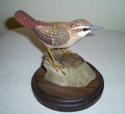
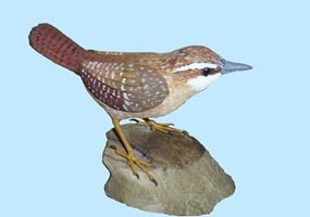
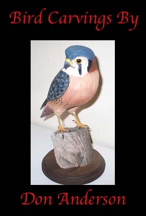
- I had to determine which birds I would display to the public. I do have favorite birds, and those were usually the ones I chose. I did try, however, to use a variety of different kinds of birds. I had hawks, owls, ducks, and songbirds. I also included a puffin to illustrate that although my grandfather primarily carved North American birds, he was occasionally coerced into making ones not native to our area. He was working on parrots, which my family had begged him to make for many years, when he passed away.
- I also had to decide if the website would be used for education, research, or just for fun. I decided to make it all three. Each bird in the exhibit includes the name of the bird, its Latin name, its habitat and feeding habits, and a catalog record. Each bird is coupled with an explanation of the carving process. The exhibit is also a bit interactive, which I hope would fall into the "fun" category.
- Finally, I had to decide how I would handle the technical problems given my limited expertise and complete lack of funding. While I wish I could have included a video of my grandfather talking about his carvings, especially now, I simply didn't have the expertise to do it. I decided that html would probably get me through most of the project but that I should also try to learn how to use Photoshop or JavaScript. I decided to use Photoshop because learning a whole new programming language would have been a project in and of itself. (I plan to teach myself JavaScript this summer.) To address the issue raised by Prof. Twidale about how to make Photoshop images accessible to the visually impaired, when you create an image map there is a thing called "alt" where you can fill in what the image is. Special browsers for the visually impaired, to the best of my knowledge, should be able to read that.
"Every Project Needs a Plan" (Caroline Cassells, Janet Strohl-Morgan, Hetty Baiz, and Janet Temos)
For the most part, the main point of this article is that museums should go into web design with a plan in mind. (My response to this was "no kidding.") However, it did illustrate that writing things down and drawing things on paper wasn't a bad idea. Starting on a design without thinking about it is not a good idea. I was already drawing pictures and writing things out, but this article confirmed in my mind that I was doing I was supposed to be doing.
I also came up with the idea for my "Bird Tree" by looking at one of the exhibit examples from this article:
Music from the Land of the Jaguar. I have never had any trouble looking at this website at home, but it does seem to have trouble loading at school.
"Usability Evaluation for Museum Web Sites" (Daniel Cunliffe, Efmorphia Kritou and Douglas Tudhope)
Cunliffe, et al. note that for many smaller museums, creating a website can be difficult due to lack of funding. Small museums frequently have to create the websites "in house," and therefore user surveys are key to determinining whether or not the museum is doing what it needs to do. The researchers noted three problems with small museum websites:
- "The majority of museum sites have been developed without a clear notion of what the site should achieve.
- The sites have not been evaluated to find out whether they match the users� needs and wishes; and
- The material on the sites tends to duplicate material in the physical museums rather than to rethink it, given the possibilities provided by the new medium." (230)
I have already addressed the issue about determining what the web page should achieve above. I have not done an official evaluation of the website, and if I were creating a site for an actual museum, I would probably want to have users checking the webpages throughout the process. I have done informal checking, though, sending the URL out to friends and family. It was clearly a biased audience, but they were able to tell me where I had problems I needed to fix. Finally, since the museum does not actually exist, I have no idea whether or not my site would duplicate the actual physical exhibit or not. The real site would probably have the actual birds on display, and it might have the stories, but they wouldn't necessarily be together. I think it would be difficult to have the stories on display since it takes a while to read them. Also, it has always been my understanding that exhibit pages are, in many ways, advertisements. One does not want complete duplication, but teasing the public a bit with what they could see if they visited is perfectly fine.
And finally...
"The Small Museum Web Site: A case study of the web site development and strategy in a small art museum" (Kristine Hoff)
According to Hoff, a museum web site is a "publishing tool," in other words, a form of advertising. This paper determines the challenges small museums face when designing web sites and how they might solve these challenges. The paper outlined stages in the design process:
- Determine the requirements of the museum and who will be in charge. (I have already illustrated requirements above and clearly I was in charge.)
- Information architecture: Sketch out what the site should look like. In other words, draw and write it out first. (Again, as I said earlier, I did this.)
- Approve the design. Do prep work like scanning images.
- Start constructing the site. Do "usability evaluations" to determine whether or not the design works. (I was testing the site all along but probably would have tested it with a wider audience if it were for a real museum and I had a group I could test it on. That, also, would have been a project in and of itself.)
- Market the site. Send it to search engines and see if people can find it. (Not really a major concern for me at this point.)
- Figure out whether or not people are using the site and keep it up to date.
I wish that I had found this article earlier because it would have been useful in the early stages of my design process. However, it did confirm in my mind that I was on the right track. Again, I'd probably do extensive usability testing if this were for an actual site. My goal, though, was to see if I could create and aesthetically pleasing, easy to use, and interesting exhibit.
How-To...
Since my web pages consisted of PhotoShop images, I thought it would be useful to show some of the stages in the design process.
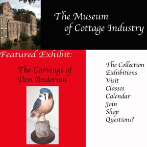
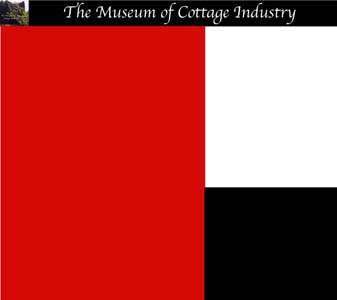
I looked at a number of Museum home pages and finally decided that I liked the design of the Minneapolis Institute of Arts the best. The design was simple and the information was easy to find. Since the home page is the gateway to an exhibit, I felt it was important to include a home page. I liked having links to the exhibits on the left, links to the areas with extra information to the right, and the name of the museum at the top.
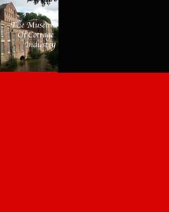
Choosing the colors required a bit of experimentation. If left to my own devices, I probably would have chosen blue and green, too. Since the MIA also used those colors, I decided to eliminate them from my choices. I have always felt that black, white, and red went well together and began to experiment with those colors. I soon discovered that creating a web page with html would be impossible. Finding colors that worked well together and could be read easily is always a challenge in web design. I started working with Photoshop, creating small images using my color schemes and adding them one piece at a time. Below are some practice homepages.
I sketched out what I wanted the home page to look like ahead of time and then started experimenting with it (above). I knew I wanted a black band across the top, red on the left, and white on the right. I had to make several different versions to finally get the right amount of each. I think I made a total of eight home pages before I got the one that is up now. The images I was working on on my desktop were never the right size; scale was a real challenge. My aunt, who is a graphics designer, finally sent along some tips on dealing with Photoshop. The home page started to look a lot better after that.
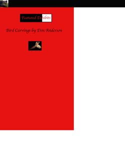
Eventually I figured out that it was much easier to fiddle with the placement of things if I had one home page background and started adding the pieces in one by one. Trying to create one huge image had proved to be impossible. Below are some of the individual pieces of the home page.
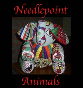
Once I finally I got the pieces fit together, I created an image map and linked the "Bird Carvings by Don Anderson" image to the exhibit introduction and "History and Research" to the site contents page. (This requires ImageReady in addition to Photoshop. It has the "alt" feature I mentioned earlier, allowing the creator to enter a few words to describe the image.) Ideally, all of the images would be linked in. The Needlepoint Animals image would take the user to the needlepoint exhibit, and all of the words on the right would be linked in, too, so the user could get information about the collections, visiting information, etc.
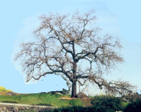
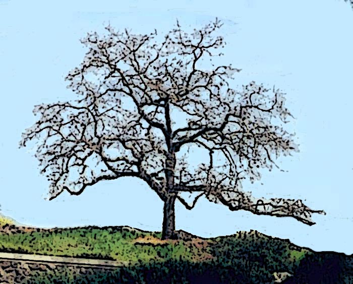
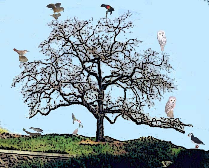
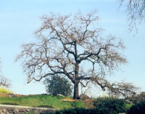
Creating the bird tree was a little more challenging. Finding a tree was difficult. I took several pictures of trees around campus, and none of them worked. I finally found one online and used it. It was protected by a creative commons license that allowed for derivatives. It can be seen here. Below I've recreated how I got the tree image to look like a drawing.
First, crop the image down so that the tree is bigger and more of a focal point.
|
Next, use the eye drop tool to match the sky color. Enlarge the image and use
the paint brush to paint out extra trees and bushes. This requires a great deal
of patience. I've done a partial image below.
Apply two filters to the image: "sharpen edges" and "poster".
Use the eye dropper again to match the sky color. Paint the background of the bird blue so it blends in.
Turn the birds into thumbnails and add them to the tree. Image map the image and then link the birds in.
Overall, the project was interesting, tedious, challenging, exciting, and a wonderful learning experience. I probably would have done it differently if I had had any experience with JavaScript but am relatively pleased with what I achieved with Photoshop. It would certainly be a useful tool for small museum's to have.
Finally, I am glad I chose to do this project because, despite its challenges, it is a lasting tribute to my grandfather. My aunt tells me he saw the exhibit shortly before he died and that he seemed to like it. In many ways it has been harder to finish this assignment because of the circumstances, but in the end I have created something for my grandfather that, I think, honors him and his craftsmanship.
To see the bibliography, museum exhibit, and full catalog go to the site contents page.
Creator: Jenny Freed
Created: 4/16/06; updated 4/30/06.
|
The tree image above is a derivative of Norman Walsh's photograph. Norman Walsh's image is protected by a Creative Commons License, which says, "You are free: to copy, distribute, display, and perform the work" and "to make derivative works." Many thanks to Mr. Walsh for his kind permission to use this image.
|

